All work. Seven projects, three years.
- Pacework Crew
- Trishakti Homestay
- Arch Veda
- Kaafi Coffee
- Chutneys By Neel
- Kutumbh Old Age Oasis
- Farmhouse for Anup Sharma
Pacework Crew
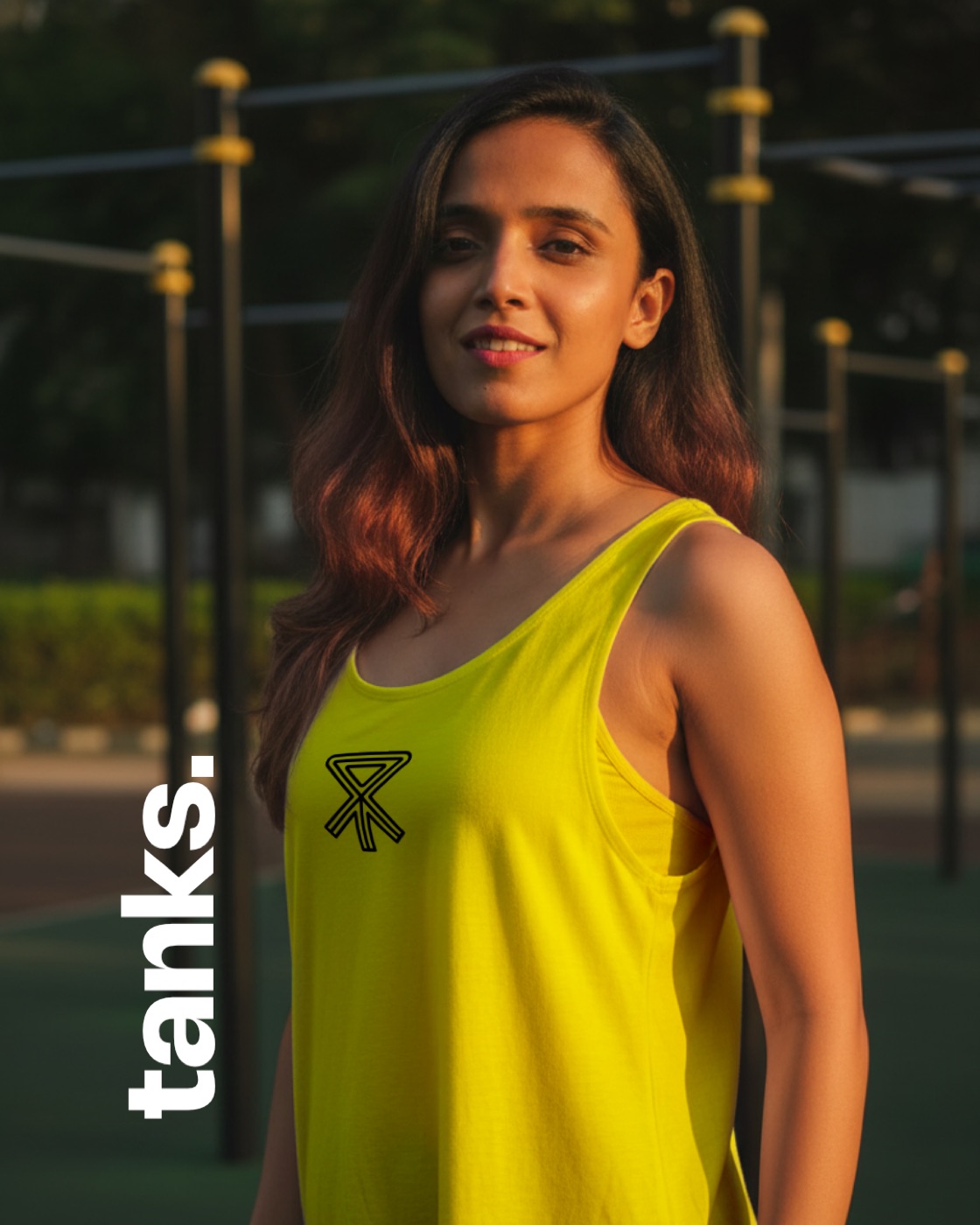
Pacework Crew is a running and fitness club in Pune, started by three friends to get people off the couch and onto the track. They needed a mark worth sweating in.
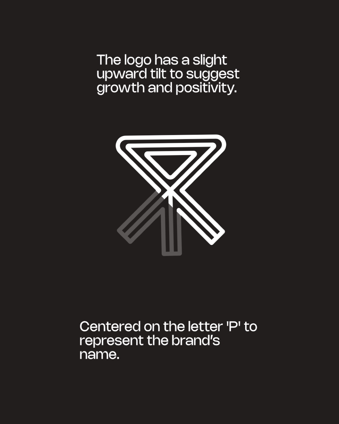
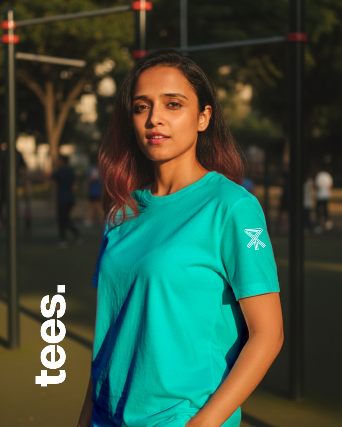
So we built it like a training plan: a finisher's ribbon wrapped around a P, an arrow for negative splits, three lines for the lanes. Then it went on the kit, with lines that talk like a coach on rep ten: “Show up. Move forward. Repeat.” and “Purpose over comfort.”

Trishakti Homestay
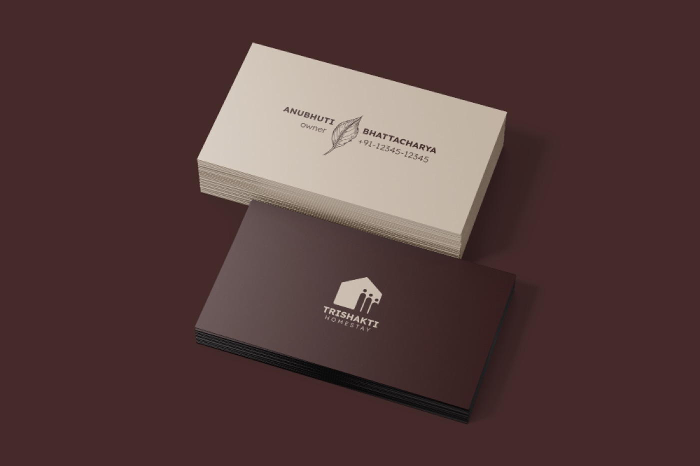
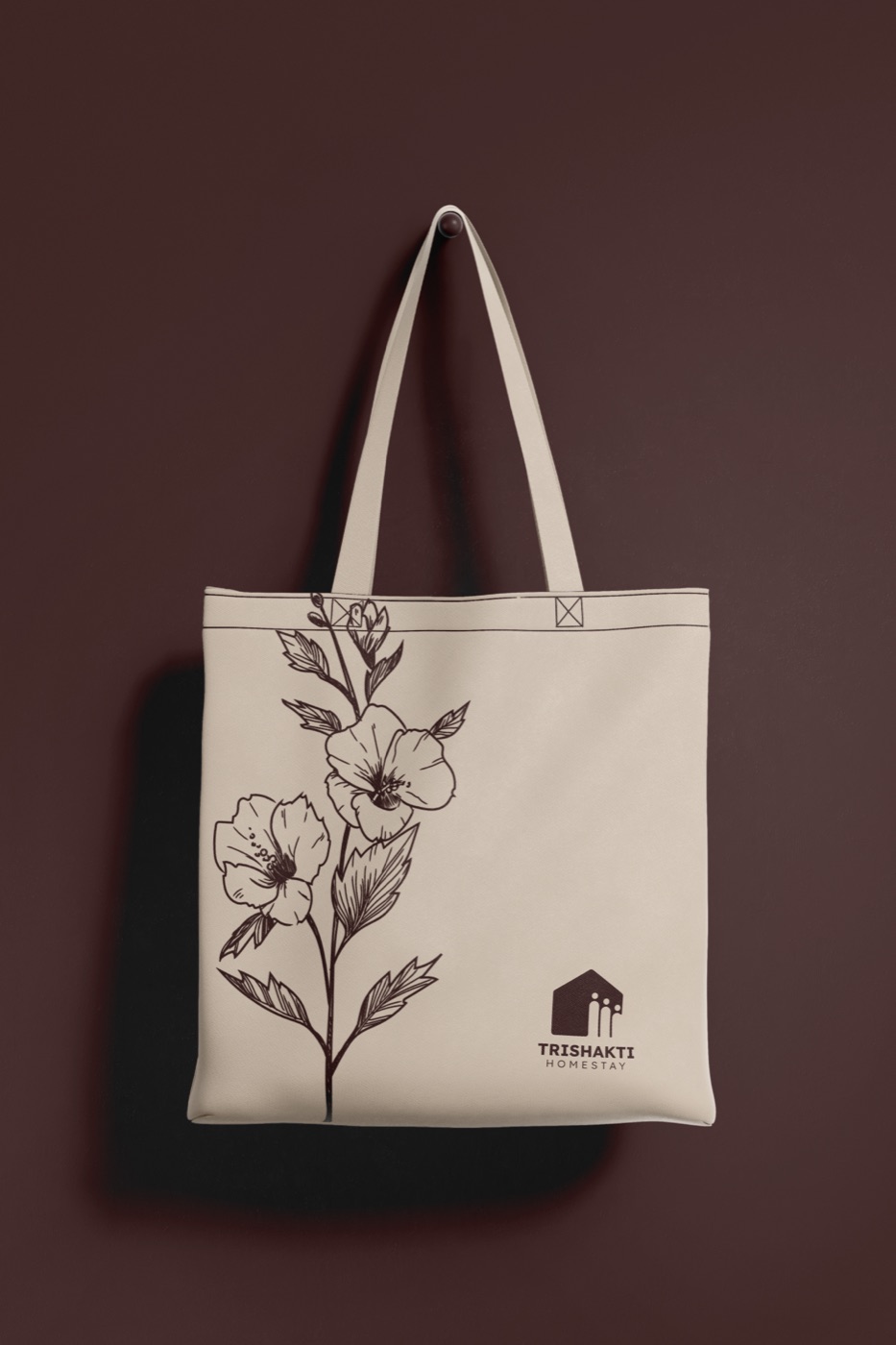
Trishakti is a homestay in Guwahati run by three women: a mother and her two daughters. It is lively when the house is full and cozy when it is quiet, and they wanted guests to feel both.
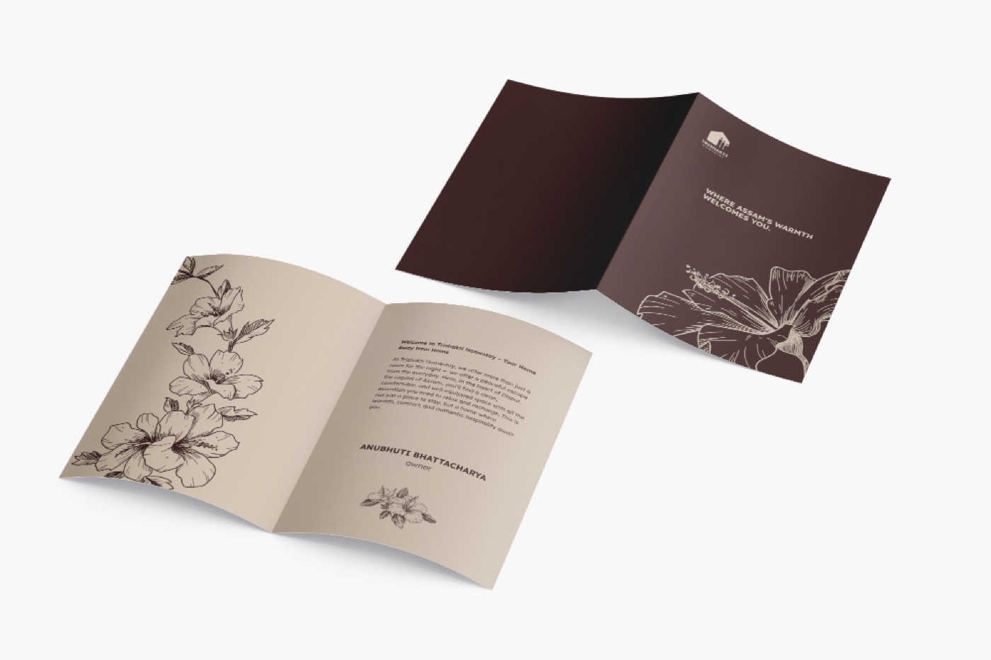
Trishakti means “three strengths”, so the mark is three figures under one roof. Maroon and blush, the colours of an Assamese home, carry it onto cards, a guest tote and a welcome booklet, with a hand-drawn flower on every piece a guest takes home.
Arch Veda
Arch Veda is an architecture podcast by Artifex Architecture Studio in Bhubaneswar, made to show more people what architects do and to talk about the building culture of Odisha.
The mark had to speak to both the profession and the place. One stroke joins the English a and the Hindi वे. We sketched it on grid paper until the two scripts shared a single line, then repeated it into a pattern, so the two keep talking wherever the podcast appears.
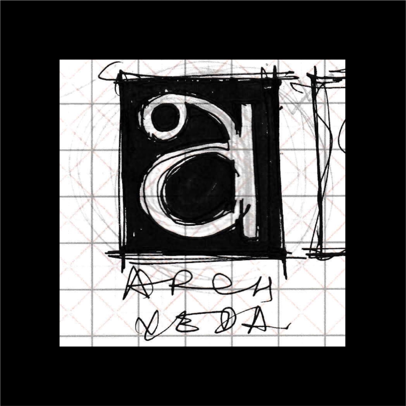
First sketch on grid paper. 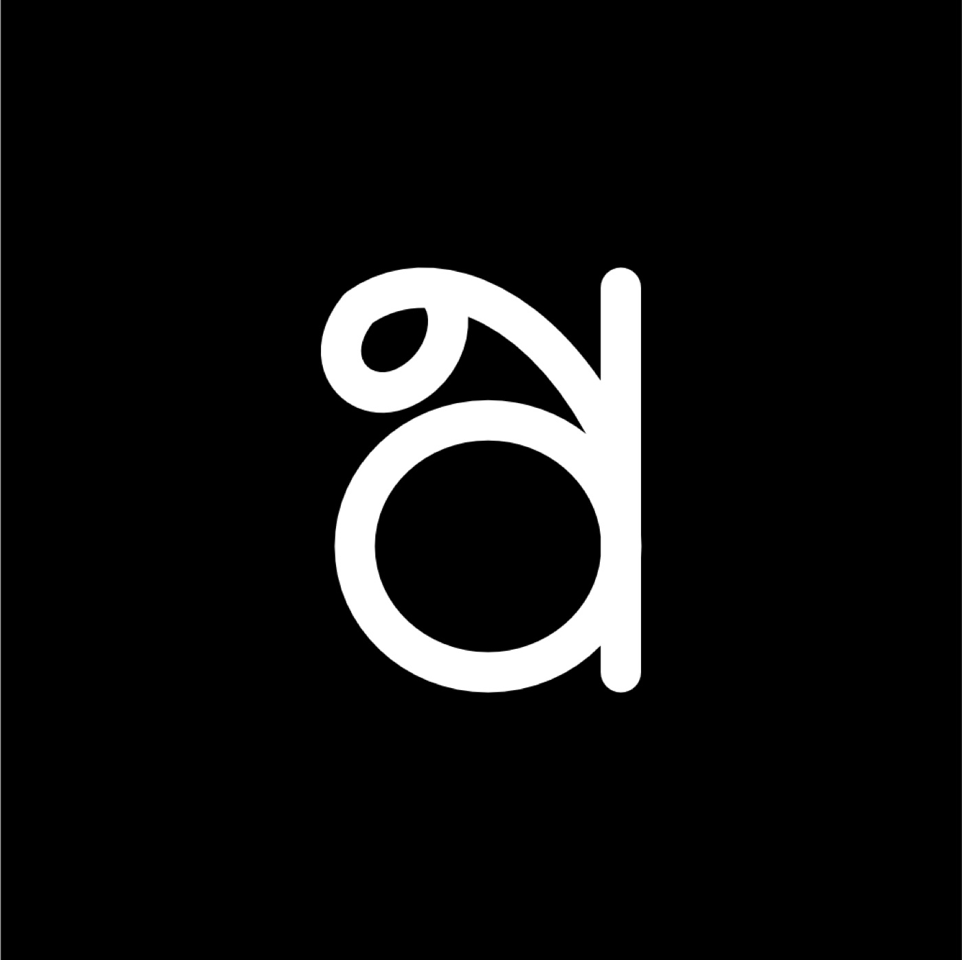
The finished mark: a and वे in one stroke. 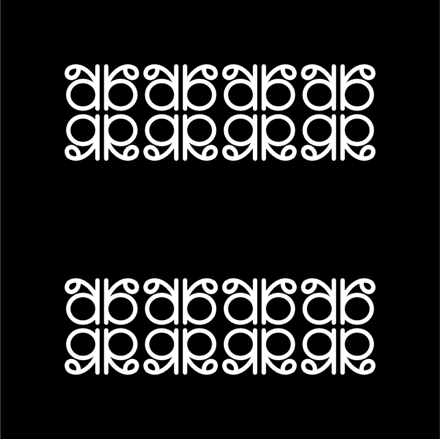
Repeated into a pattern.
Kaafi Coffee
A coffee brand named in two scripts: काफी in Devanagari over COFFEE in wide Latin capitals, so it reads in Hindi and English at a glance. We drew it in black first. It only got colour once it worked without any.
Three dogs carry the brand: sleepy pink, calm teal and wide-eyed yellow, each tied to one colour, so you see the colour and know the dog. The same three go on cups, tubes and cans, each with a line in its own mood: "At a normal pace", "Medium hard", "HAAAAAAARD!"
The wordmark in black, before any colour. 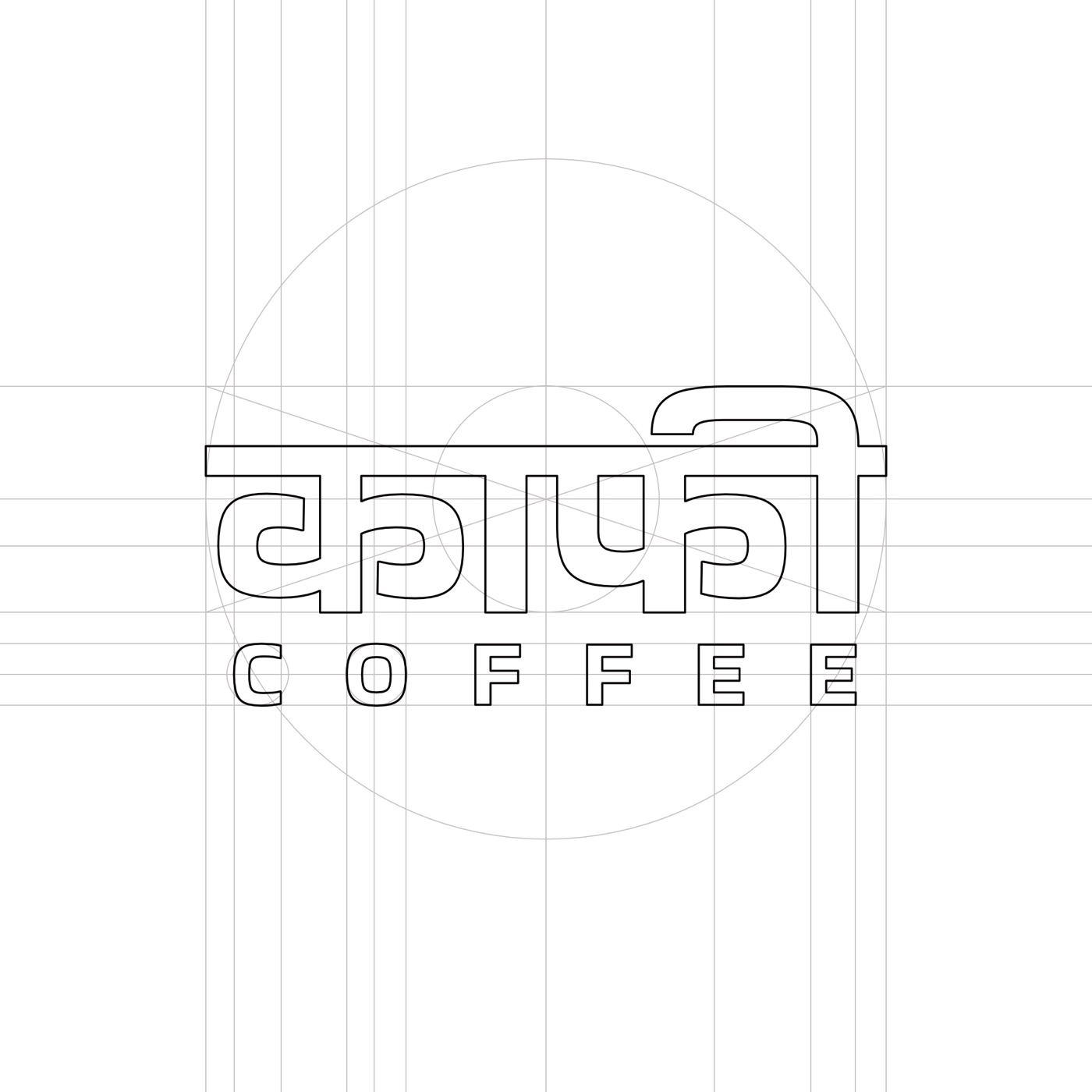
Built on guides: the Devanagari top line sets the width. 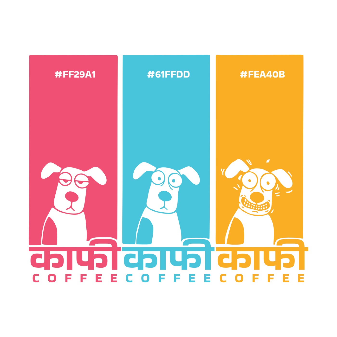
Three dogs, three colours, one wordmark. 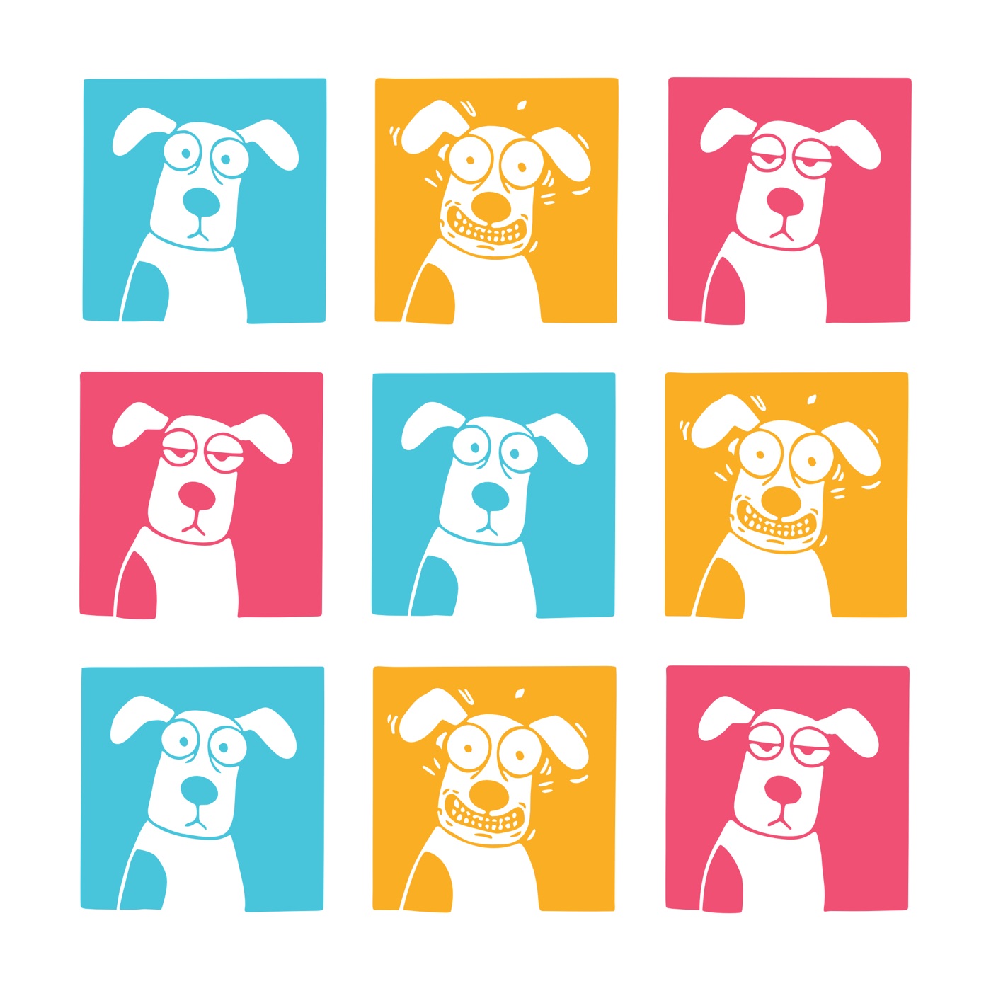
Shuffle the grid and it still reads. 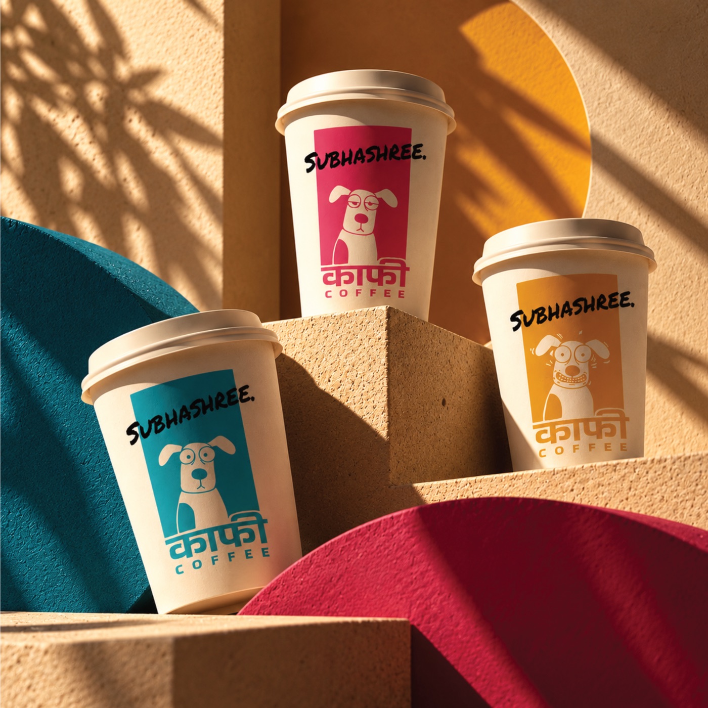
One colour per cup, known from across the room. 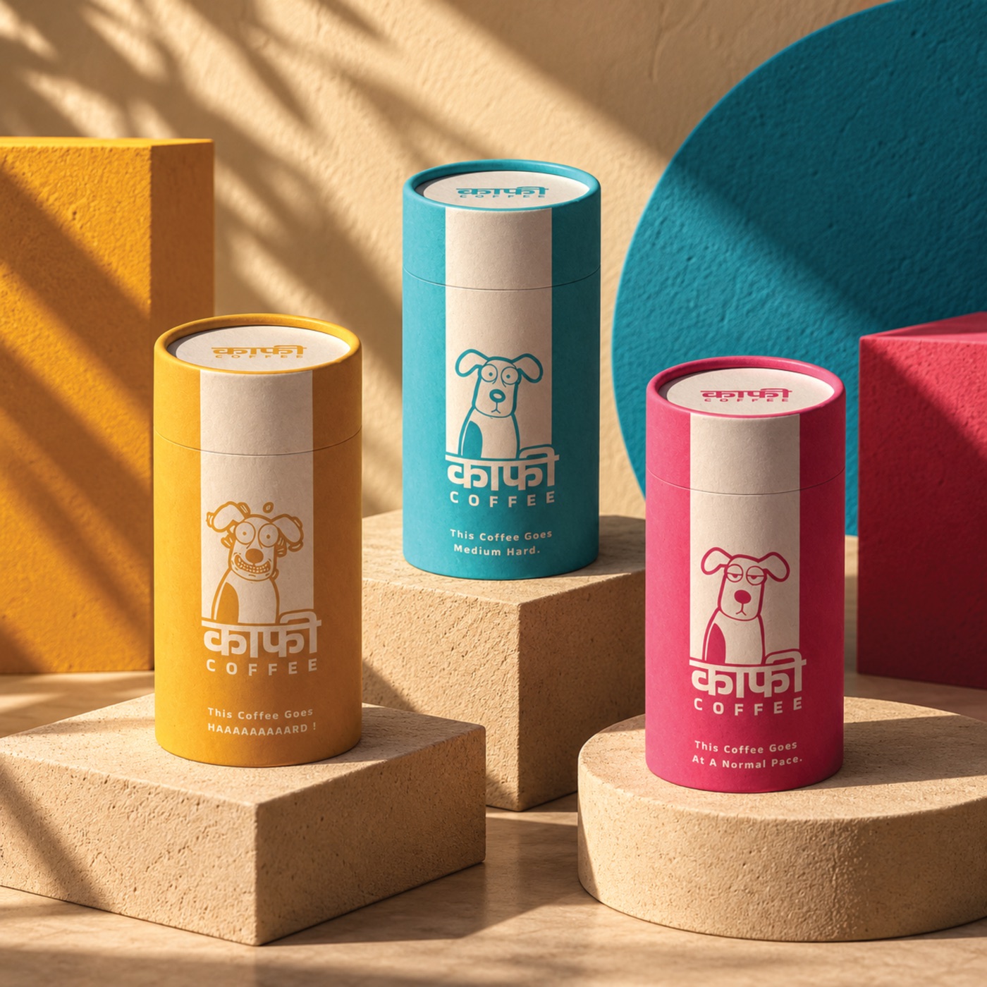
Tubes, each with a line for its dog's mood. 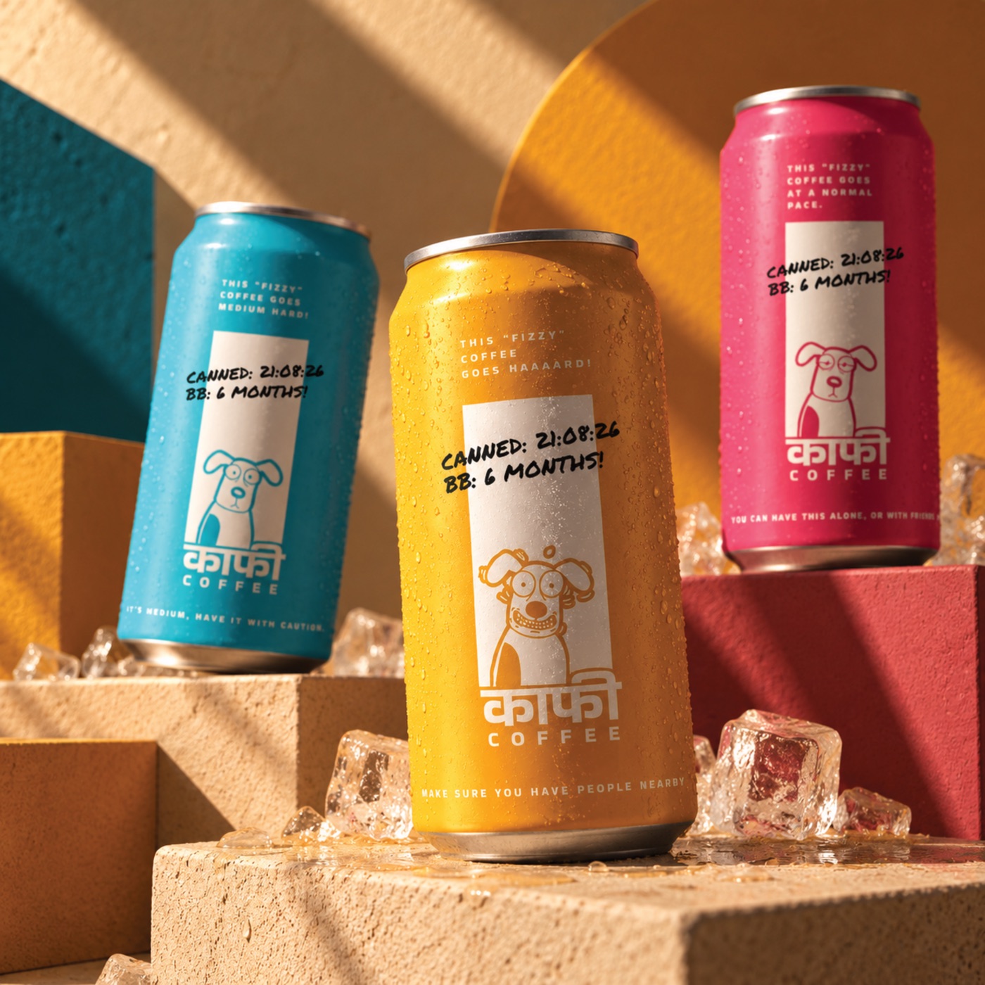
The same system on cans.
Chutneys By Neel
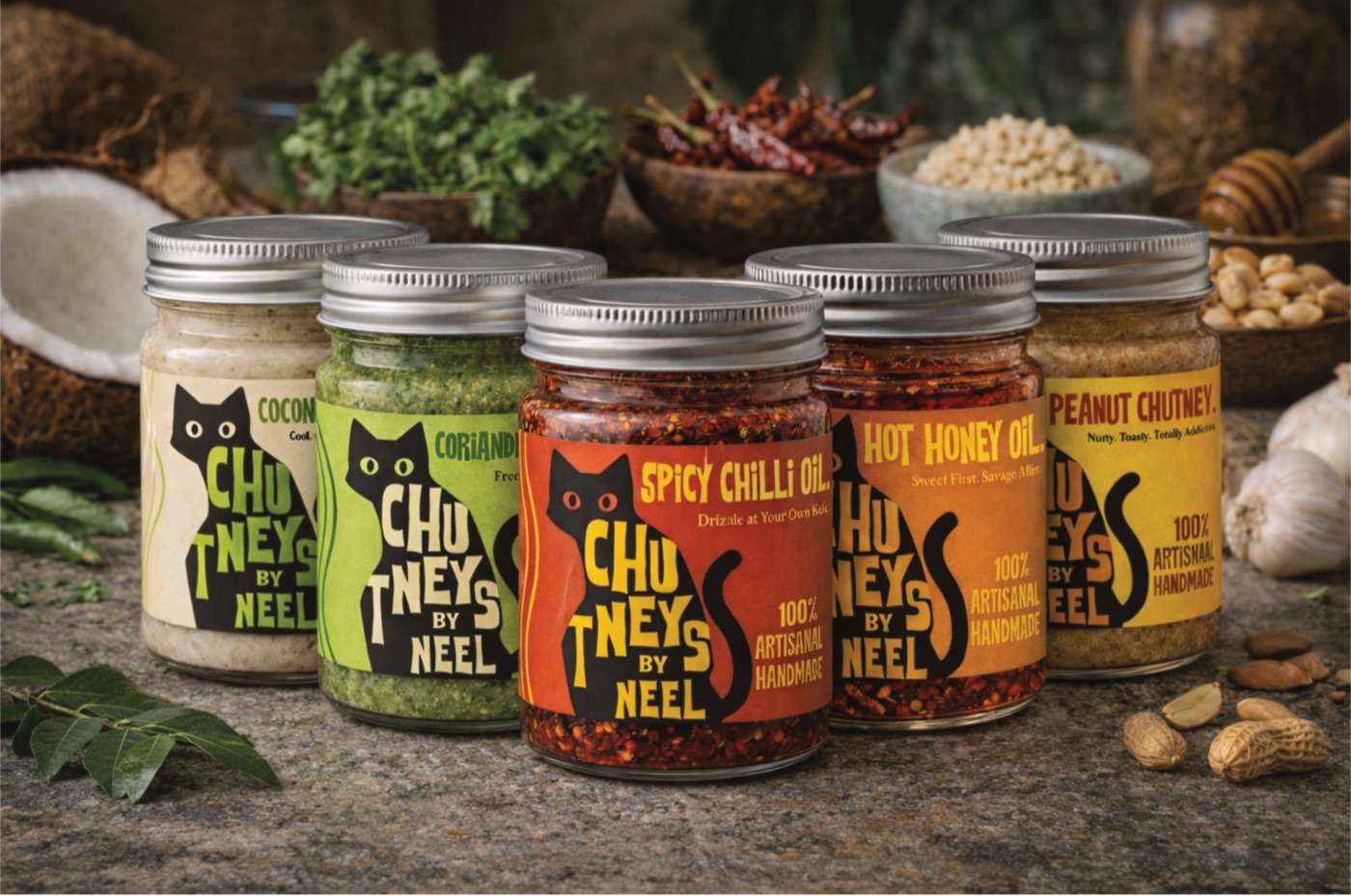
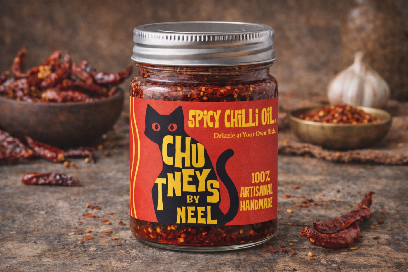
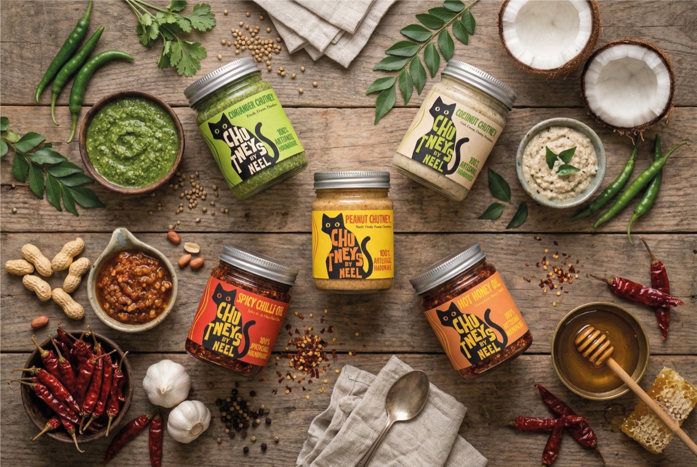
Shankhanil Chakraborty makes chutneys by hand in Bhubaneswar, the quick-use kind you spoon straight from the jar, and ships them across the city and the rest of India. He needed a jar that sells itself on a shelf and on a doorstep.
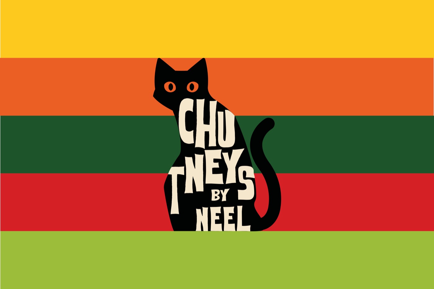
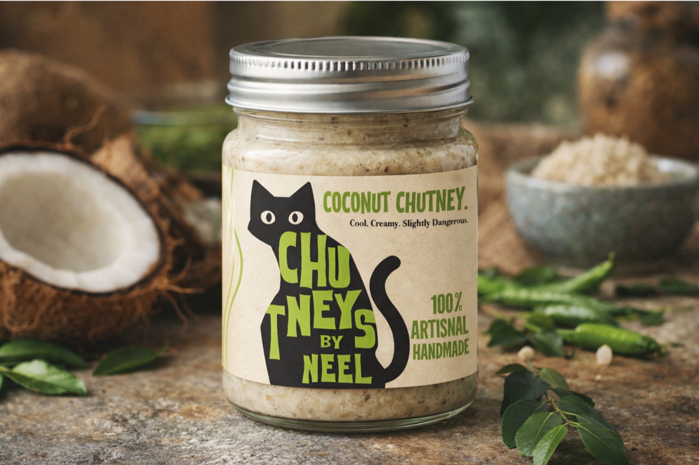
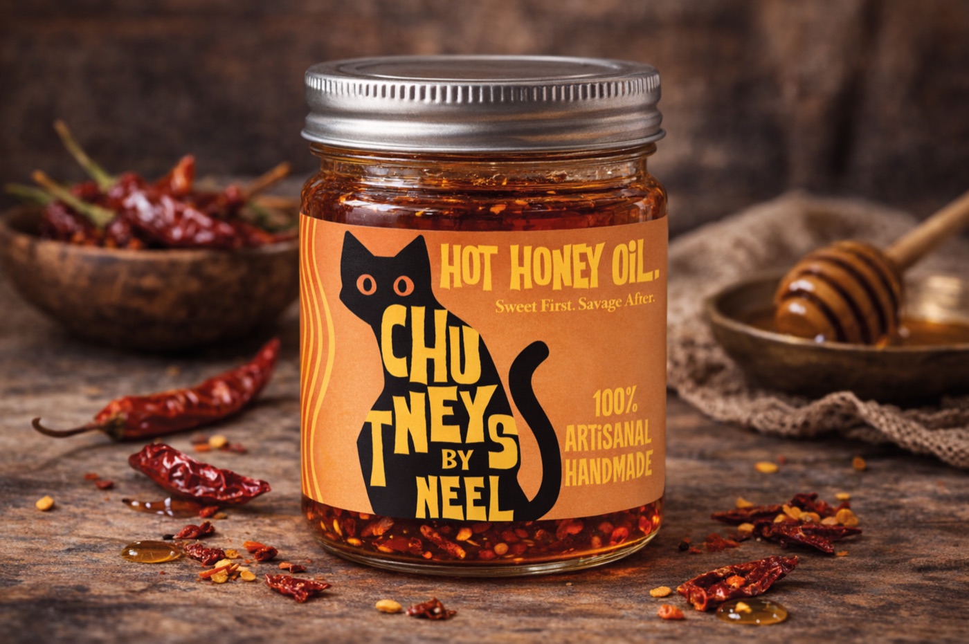
The name sits inside a black cat, his way of remembering a much-loved pet, and it gives the brand its story. Each flavour gets its own colour and its own line. Coconut is “Cool. Creamy. Slightly dangerous.” Hot honey oil is “Sweet first. Savage after.” The chilli oil just says “Drizzle at your own risk.”